
四种网站新年灯笼效果代码-过年了让你的博客喜庆的灯笼源码-html网站灯笼纯代码
前言
快来给你的网站增添一抹春节的喜庆色彩吧!想象一下,当访客打开你的网站,一对红彤彤的灯笼在右上角摇曳生姿,瞬间就能感受到浓浓的节日氛围。
安鹿准备了四段红灯笼的代码,让你能够轻松实现这一效果。这几段代码不仅简单易用,而且经过精心调试,确保在各种设备上都能完美呈现。无论是电脑端还是移动端,都能让红灯笼高高挂起,为你的网站增添一份独特的魅力。
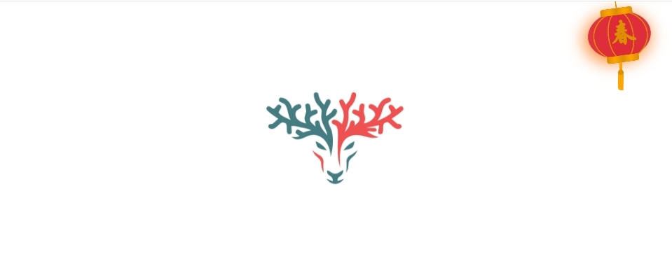
教程一-单个
示图:
 代码:
代码:
<!--春节单灯笼代码-->
<!-- 灯笼2by安鹿www.anlu1314.com -->
<div class="deng-box1">
<div class="deng">
<div class="xian"></div>
<div class="deng-a">
<div class="deng-b">
<div class="deng-t">春</div>
</div>
</div>
<div class="shui shui-a">
<div class="shui-c"></div>
<div class="shui-b"></div>
</div>
</div>
</div>
<style>
.deng-box {
position: fixed;
top: -40px;
right: -20px;
z-index: 9999;
pointer-events: none;
}
.deng-box1 {
position: fixed;
top: -30px;
right: 10px;
z-index: 9999;
pointer-events: none;
}
.deng-box1 .deng {
position: relative;
width: 120px;
height: 90px;
margin: 50px;
background: #d8000f;
background: rgba(216, 0, 15, 0.8);
border-radius: 50% 50%;
-webkit-transform-origin: 50% -100px;
-webkit-animation: swing 5s infinite ease-in-out;
box-shadow: -5px 5px 30px 4px rgba(252, 144, 61, 1);
}
.deng {
position: relative;
width: 120px;
height: 90px;
margin: 50px;
background: #d8000f;
background: rgba(216, 0, 15, 0.8);
border-radius: 50% 50%;
-webkit-transform-origin: 50% -100px;
-webkit-animation: swing 3s infinite ease-in-out;
box-shadow: -5px 5px 50px 4px rgba(250, 108, 0, 1);
}
.deng-a {
width: 100px;
height: 90px;
background: #d8000f;
background: rgba(216, 0, 15, 0.1);
margin: 12px 8px 8px 10px;
border-radius: 50% 50%;
border: 2px solid #dc8f03;
}
.deng-b {
width: 45px;
height: 90px;
background: #d8000f;
background: rgba(216, 0, 15, 0.1);
margin: -2px 8px 8px 26px;
border-radius: 50% 50%;
border: 2px solid #dc8f03;
}
.xian {
position: absolute;
top: -20px;
left: 60px;
width: 2px;
height: 20px;
background: #dc8f03;
}
.shui-a {
position: relative;
width: 5px;
height: 20px;
margin: -5px 0 0 59px;
-webkit-animation: swing 4s infinite ease-in-out;
-webkit-transform-origin: 50% -45px;
background: #ffa500;
border-radius: 0 0 5px 5px;
}
.shui-b {
position: absolute;
top: 14px;
left: -2px;
width: 10px;
height: 10px;
background: #dc8f03;
border-radius: 50%;
}
.shui-c {
position: absolute;
top: 18px;
left: -2px;
width: 10px;
height: 35px;
background: #ffa500;
border-radius: 0 0 0 5px;
}
.deng:before {
position: absolute;
top: -7px;
left: 29px;
height: 12px;
width: 60px;
content: " ";
display: block;
z-index: 999;
border-radius: 5px 5px 0 0;
border: solid 1px #dc8f03;
background: #ffa500;
background: linear-gradient(to right, #dc8f03, #ffa500, #dc8f03, #ffa500, #dc8f03);
}
.deng:after {
position: absolute;
bottom: -7px;
left: 10px;
height: 12px;
width: 60px;
content: " ";
display: block;
margin-left: 20px;
border-radius: 0 0 5px 5px;
border: solid 1px #dc8f03;
background: #ffa500;
background: linear-gradient(to right, #dc8f03, #ffa500, #dc8f03, #ffa500, #dc8f03);
}
.deng-t {
font-family: 华文行楷, Arial, Lucida Grande, Tahoma, sans-serif;
font-size: 3.2rem;
color: #dc8f03;
font-weight: bold;
line-height: 85px;
text-align: center;
}
.night .deng-t,
.night .deng-box,
.night .deng-box1 {
background: transparent !important;
}

@-moz-keyframes swing {
0% {
-moz-transform: rotate(-10deg)
}
50% {
-moz-transform: rotate(10deg)
}
100% {
-moz-transform: rotate(-10deg)
}
}
@-webkit-keyframes swing {
0% {
-webkit-transform: rotate(-10deg)
}
50% {
-webkit-transform: rotate(10deg)
}

100% {
-webkit-transform: rotate(-10deg)
}
}
</style>
修改位置:将代码复制到网站模板的公共页眉或页脚中,并自定义标签上方的页眉HTML代码。
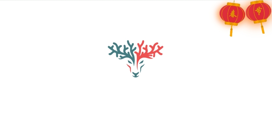
教程二-右侧
示图:
修改位置:将代码复制到网站模板的公共页眉或页脚中,并自定义标签上方的页眉HTML代码。
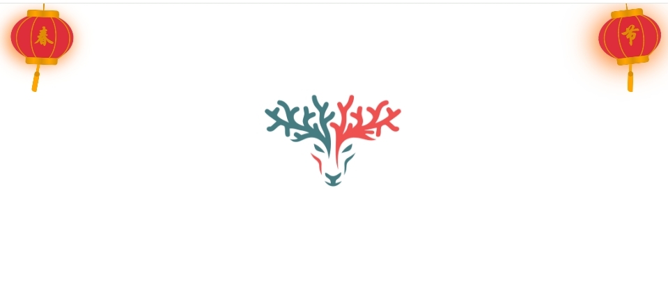
教程三-两边
示图:
修改位置:将代码复制到网站模板的公共页眉或页脚中,并自定义标签上方的页眉HTML代码。
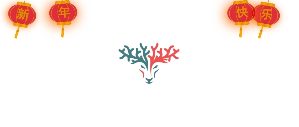
教程四-四个
示图:
代码:
<!--春节四灯笼代码by安鹿www.anlu1314.com-->
<meta charset="utf-8">
<div class="deng-box2">
<div class="deng">
<div class="xian">
</div>
<div class="deng-a">
<div class="deng-b">
<div class="deng-t">年</div>
</div>
</div>
<div class="shui shui-a">
<div class="shui-c">
</div>
<div class="shui-b"></div>
</div>
</div>
</div>
<div class="deng-box3">
<div class="deng">
<div class="xian">
</div>
<div class="deng-a">
<div class="deng-b">
<div class="deng-t">新</div>
</div>
</div>
<div class="shui shui-a">
<div class="shui-c"></div>
<div class="shui-b">
</div>
</div>
</div>
</div>
<div class="deng-box1">
<div class="deng">
<div class="xian">
</div>
<div class="deng-a">
<div class="deng-b">
<div class="deng-t">乐</div>
</div>
</div>
<div class="shui shui-a">
<div class="shui-c"></div>
<div class="shui-b"></div>
</div>
</div>
</div>
<div class="deng-box">
<div class="deng">
<div class="xian">
</div>
<div class="deng-a">
<div class="deng-b">
<div class="deng-t">快</div>
</div>
</div>
<div class="shui shui-a">
<div class="shui-c">
</div>
<div class="shui-b"></div>
</div>
</div>
</div>
<style type="text/css">
.deng-box {
position: fixed;
top: -40px;
right: 150px;
z-index: 9999;
pointer-events: none;
}
.deng-box1 {
position: fixed;
top: -30px;
right: 10px;
z-index: 9999;
pointer-events: none
}

.deng-box2 {
position: fixed;
top: -40px;
left: 150px;
z-index: 9999;
pointer-events: none
}
.deng-box3 {
position: fixed;
top: -30px;
left: 10px;
z-index: 9999;
pointer-events: none
}
.deng-box1 .deng,
.deng-box3 .deng {
position: relative;
width: 120px;
height: 90px;
margin: 50px;
background: #d8000f;
background: rgba(216, 0, 15, .8);
border-radius: 50% 50%;
-webkit-transform-origin: 50% -100px;
-webkit-animation: swing 5s infinite ease-in-out;
box-shadow: -5px 5px 30px 4px #fc903d
}
.deng {
position: relative;
width: 120px;
height: 90px;
margin: 50px;
background: #d8000f;
background: rgba(216, 0, 15, .8);
border-radius: 50% 50%;
-webkit-transform-origin: 50% -100px;
-webkit-animation: swing 3s infinite ease-in-out;
box-shadow: -5px 5px 50px 4px #fa6c00
}
.deng-a {
width: 100px;
height: 90px;
background: #d8000f;
background: rgba(216, 0, 15, .1);
margin: 12px 8px 8px 8px;
border-radius: 50% 50%;
border: 2px solid #dc8f03
}
.deng-b {
width: 45px;
height: 90px;
background: #d8000f;
background: rgba(216, 0, 15, .1);
margin: -4px 8px 8px 26px;
border-radius: 50% 50%;
border: 2px solid #dc8f03
}
.xian {
position: absolute;
top: -20px;
left: 60px;
width: 2px;
height: 20px;
background: #dc8f03
}
.shui-a {
position: relative;
width: 5px;
height: 20px;
margin: -5px 0 0 59px;
-webkit-animation: swing 4s infinite ease-in-out;
-webkit-transform-origin: 50% -45px;
background: orange;
border-radius: 0 0 5px 5px
}
.shui-b {
position: absolute;
top: 14px;
left: -2px;
width: 10px;
height: 10px;
background: #dc8f03;
border-radius: 50%
}
.shui-c {
position: absolute;
top: 18px;
left: -2px;
width: 10px;
height: 35px;
background: orange;
border-radius: 0 0 0 5px
}
.deng:before {
position: absolute;
top: -7px;
left: 29px;
height: 12px;
width: 60px;
content: " ";
display: block;
z-index: 999;
border-radius: 5px 5px 0 0;
border: solid 1px #dc8f03;
background: orange;
background: linear-gradient(to right, #dc8f03, orange, #dc8f03, orange, #dc8f03)
}
.deng:after {
position: absolute;
bottom: -7px;
left: 10px;
height: 12px;
width: 60px;
content: " ";
display: block;
margin-left: 20px;
border-radius: 0 0 5px 5px;
border: solid 1px #dc8f03;
background: orange;
background: linear-gradient(to right, #dc8f03, orange, #dc8f03, orange, #dc8f03)
}
.deng-t {
font-family: 黑体, Arial, Lucida Grande, Tahoma, sans-serif;
font-size: 3.2rem;
color: #dc8f03;
font-weight: 700;
line-height: 85px;
text-align: center
}
.night .deng-box,
.night .deng-box1,
.night .deng-t {
background: 0 0 !important
}
@-moz-keyframes swing {
0% {
-moz-transform: rotate(-10deg)
}
50% {
-moz-transform: rotate(10deg)
}
100% {
-moz-transform: rotate(-10deg)
}
}
@-webkit-keyframes swing {
0% {
-webkit-transform: rotate(-10deg)
}
50% {
-webkit-transform: rotate(10deg)
}
100% {
-webkit-transform: rotate(-10deg)
}
}
</style>
修改位置:将代码复制到网站模板的公共页眉或页脚中,并自定义标签上方的页眉HTML代码。
代码下载
百度网盘:
https://pan.baidu.com/s/1XYaJRs2uR58vsAztHllsuw?pwd=6se6
🔆高速免登录在线下载链接如下🔆
提示
数据无价,请提前备份,建议建立一个文件修改记录,以便后期查阅自己修改了哪些内容
修改完毕后,刷新一下浏览器缓存,再次访问网站,即可看到修改后的效果
🌟-阅读剩余-🌟
THE END
